feat: SW-2591 add size prop to Input, Textarea, Select and Combobox - #212
feat: SW-2591 add size prop to Input, Textarea, Select and Combobox#212boramyi-ts wants to merge 7 commits into
Conversation


…lect

Give the core form inputs the shared control scale — 24 / 28 / 32 / 36,
radius 8 at xs/sm and 10 at default/lg, matching Button:
- Input & Textarea: new CVA size variant (Textarea steps min-height 48/56/64/80).
  Input keeps the native size attr available as htmlSize since the CVA prop
  takes the size name.
- Select trigger: extend the size prop from sm|default to xs|sm|default|lg.
- InputGroupInput now types its props off Input so the size prop flows through.

Existing default rendering is unchanged (default variant == prior classes).

Co-Authored-By: Claude Opus 4.8 <noreply@anthropic.com>


|
The latest updates on your projects. Learn more about Vercel for GitHub.
|


![unblocked[bot]](https://avatars.githubusercontent.com/in/166219?s=60&v=4)

There was a problem hiding this comment.
✅ No issues found
About Unblocked
Unblocked has been set up to automatically review your team's pull requests to identify genuine bugs and issues.
📖 Documentation — Learn more in our docs.
💬 Ask questions — Mention @unblocked to request a review or summary, or ask follow-up questions.
👍 Give feedback — React to comments with 👍 or 👎 to help us improve.
⚙️ Customize — Adjust settings in your preferences.


Extend the shared control scale to the combobox family:
- InputGroup gains a size prop (xs/sm/default/lg) driving container height +
  radius, and provides it via context so the inner control fills the height.
- ComboboxInput forwards size to InputGroup.
- ComboboxChips gains size: container min-height matches Select/Combobox per
  size (24/28/32/36), and the chip pill + remove-X scale via group-data.

The ComboboxChips default min-height goes 48 -> 32 so single/multi selects line
up with Select at the same size (harmonization; existing multi-selects get
shorter and grow as chips wrap).

Co-Authored-By: Claude Opus 4.8 <noreply@anthropic.com>
boramyi-ts
changed the title


 owilliams-tetrascience
left a comment
owilliams-tetrascience
left a comment
owilliams-tetrascience
left a comment
There was a problem hiding this comment.

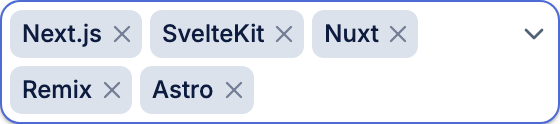
Can you adjust the padding and where the toggle icon lands when there is multiple lines?
Review feedback (#212): with chips wrapping to multiple rows the chevron
floated on the last row. Pin it absolutely to the top-right, sized to the
first row per size, and reserve right padding so chips wrap before it — so the
toggle lands consistently with the input row regardless of chip rows.
|
@owilliams-tetrascience fixed — thanks for catching it. On multiple lines the toggle chevron was a wrapping flow item, so it dropped to the last row. It's now pinned to the top-right and sized to the first row, with right padding reserved so chips wrap before it — the chevron stays aligned with the input row no matter how many rows of chips there are. Single-line and xs are unchanged.
Combobox suite still passes 21/21. (bf38291) |

Coverage Report
File Coverage
|
||||||||||||||||||||||||||||||||||||||||||||||||||||||||||||||
2 participants


SW-2591 — add
sizeprop to Input, Textarea & SelectJira: SW-2591
Next slice of the input-size harmonization (after #211 toggles). Gives the core form inputs the shared control scale — 24 / 28 / 32 / 36, radius 8 at xs/sm and 10 at default/lg — matching Button.
Changes
sizevariant (xs | sm | default | lg, defaultdefault). Since the CVA prop takes thesizename, the native HTMLsizeattribute is available ashtmlSize(the native prop isOmit-ted to avoid the type clash).sizeprop; steps min-height 48 / 56 / 64 / 80 with matching padding/radius/text.sizeprop fromsm | defaulttoxs | sm | default | lg.Input, so thesizeprop flows through the input-group control.defaultis kept as the canonical mid size (consistent with Button/Select today), so existing rendering is unchanged — thedefaultvariant is exactly the previous classes.Size ladder (measured height · radius)
Tests
New
ExtraSmall/Largestories assert the rendered height (input/select 24px & 36px; textarea 48px min-height) +data-size. Full Input/Textarea/Select/InputGroup play suites pass (26/26) incl. axe; typecheck + lint clean. Zephyr ids for the new stories viazephyr_sync.Note on scope / breaking
Input'ssizeprop is now the size variant, not the native char-width attribute — passhtmlSizefor the latter (type-level change only, no runtime behavior change).Combobox / ComboboxChips (single + multi) are the remaining input slice — they compose
InputGroupand the multi-select needs the chip-pill + remove-X scaling — tracked as the next follow-up PR.🤖 Generated with Claude Code
Update: Combobox family added
Extended the same
sizeprop to the combobox family so the whole input group is harmonized in one PR:sizeprop (xs/sm/default/lg) drives container height + radius, and is provided via context so the inner control fills the height.sizetoInputGroup; renders at 24 / 28 / 32 / 36.sizesets the container min-height to match Select/Combobox per size, and the chip pill + remove-X scale viagroup-data(chip 16/20/24/28, concentric radius 4/4/6/6).New
ExtraSmall(single, asserts input-group 24px) andMultiExtraSmall(multi, asserts chip pill 16px) stories; full Combobox + InputGroup suites pass (29/29).Behavior change to call out:
ComboboxChipsdefault min-height goes 48 → 32 so single/multi selects line up withSelectat the same size — existing multi-selects get shorter (and still grow as chips wrap). This also aligns the chips radius torounded-lg, overlapping the intent of #206 (combobox radius) — coordinate so they don't both change it.Folds in #206 (SW-2583) — closing that PR
This PR now also carries #206's default multi-select chevron:
ComboboxChipsgainsshowTrigger(defaulttrue) rendering the dropdown chevron at the inline end, so single- and multi-select share the affordance. #206's other change —ComboboxChipsradiusrounded-md → rounded-lg— is already delivered here by the sizedefault. So #206 is fully superseded and closed; itsRadiusConsistencyintent is guarded by this PR's size stories, and the chevron by aMultiExtraSmallassertion.