Give every labelled y-axis value a tick in the fast charts - #2399
Conversation


The ECharts y-axis asked for minor ticks to get the finer gridlines between
the major value lines. Those minor ticks are drawn on the axis itself, halfway
between the labelled values (e.g. at 25 and 75 for labels at 0, 50 and 100),
which reads as if the ticks and labels were misaligned.

Hiding the minor ticks keeps the minor gridlines, which follow
minorTick.splitNumber whether or not the ticks themselves are shown.

Signed-off-by: F.N. Claessen <felix@seita.nl>

Documentation build overview
|


 Ahmad-Wahid
left a comment
Ahmad-Wahid
left a comment
Ahmad-Wahid
left a comment
There was a problem hiding this comment.

The ticks are now completely gone.


The ECharts y-axis never set axisTick, so it fell back to the "auto" default,
which resolves to hidden for a value axis whose partner axis is a time axis.
The labelled values ended up floating next to the grid without a tick mark,
unlike in the Vega-Lite charts.

Showing the major ticks puts one mark per label. The minor ticks stay hidden,
so nothing is drawn halfway between the labels.

Co-Authored-By: Claude Opus 5 <noreply@anthropic.com>

|
Fixed: |


|
Interesting - the ticks are not near the label, but the lines behind the graph still are in between the labelled values. |
Context:
- Review of the first attempt: hiding the minor ticks left the y-axis without any
  ticks at all. The major ticks were never drawn: a value axis defaults to
  axisTick.show 'auto', which resolves to false next to a time axis, so the minor
  ticks halfway between the labels were the only ones there

Change:
- Show the axis ticks explicitly, so each labelled value has one, and restore the
  minor ticks (shorter) between them

Signed-off-by: F.N. Claessen <felix@seita.nl>
…into fix/echarts-y-axis-minor-ticks

Signed-off-by: F.N. Claessen <felix@seita.nl>

# Conflicts:
#	flexmeasures/ui/static/js/fast-chart.js
Flix6x
changed the title

|
@Ahmad-Wahid you were right, and thanks for pushing the diagnosis — I merged your commit and made one change on top: the minor ticks are shown again. Losing them was not the intention — they came with the finer gridlines, and the requirement is that each label has at least a tick, not that nothing else does. So the axis now has a tick at every labelled value plus the shorter minor ones in between, which is also how the Vega-Lite charts read. Rendered the real chart through a harness to check both ends: the labels each have a tick, and the minor ticks are visibly shorter, so the hierarchy still reads correctly. Happy to drop them again if you prefer the cleaner look — your call, since it is your review. 🤖 Generated with Claude Code |
|
@nhoening good catch, and that half was still open when you looked. Here is where it stands after the last push:
That mirrors what the Vega-Lite charts do: gridlines sit at every step, and labels are thinned out when they would overlap, which is why a line can appear where no label does. The minor gridlines in the ECharts port were added to reproduce that ( The alternative, if you would rather not have anything between the labelled values at all, is to drop the minor gridlines and their ticks, so gridlines, ticks and labels all sit at the same values. That is a deliberate look change to the charts as merged in #2234, so I would rather not make that call in this PR — happy to do it here or in a follow-up if you prefer it. Which do you like better? 🤖 Generated with Claude Code |
|
Can we get a new screen shot? |
|
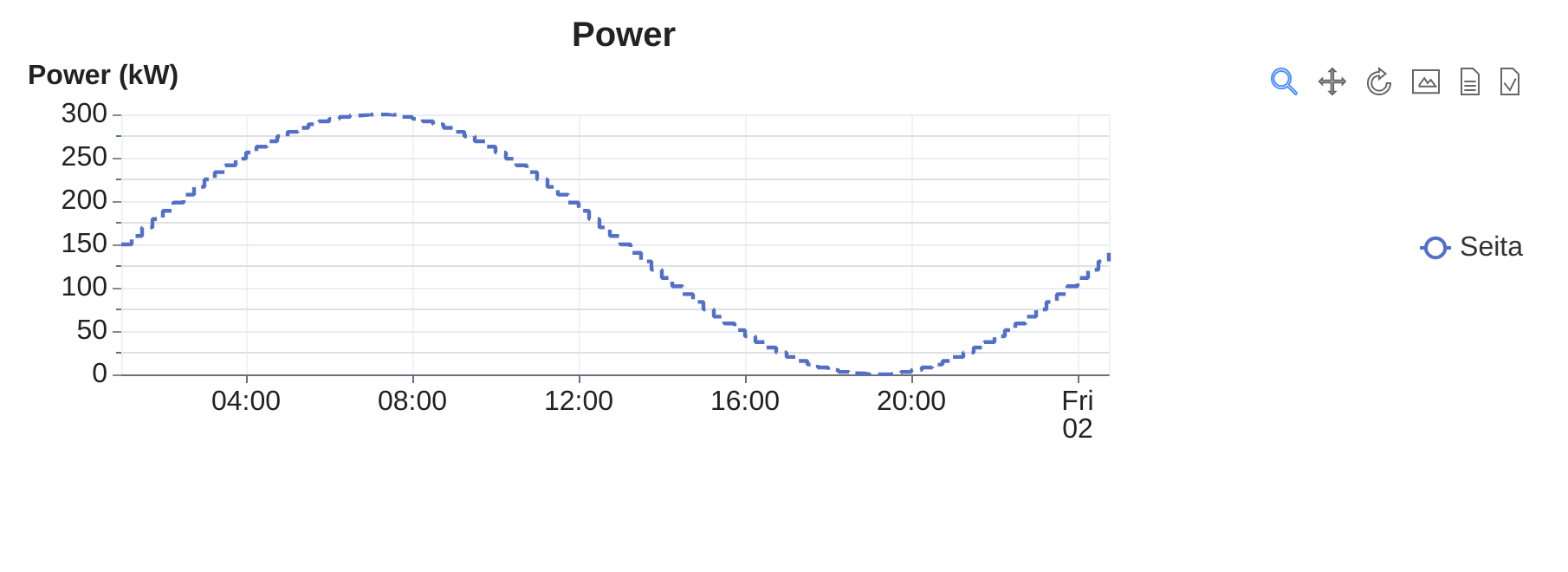
@nhoening here you go — rendered from the current head of this branch. The chart:
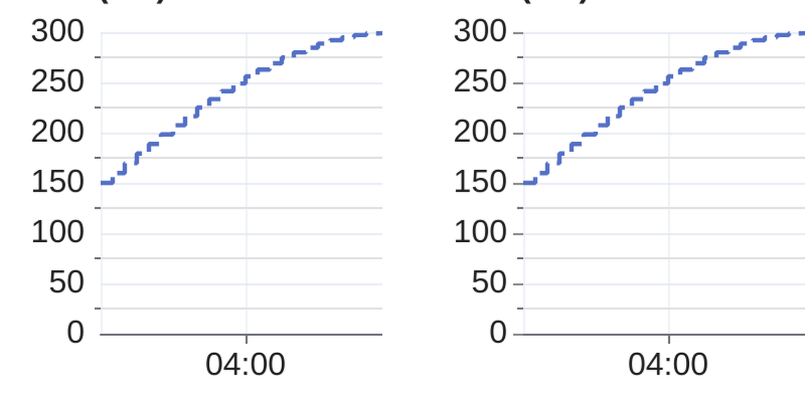
The y-axis up close — before (left) and after (right):
On the left, every tick sits between two labels and the labels themselves have none. On the right, each label has its own longer tick, and the shorter ticks mark the finer gridlines in between — so nothing is drawn behind the graph without a mark on the axis. Both were rendered through a harness that runs the real If you would rather have nothing at all between the labelled values, the alternative is to drop the minor gridlines and their ticks — say the word and I will push that instead. 🤖 Generated with Claude Code |
3 participants


Description
On the fast (ECharts) charts, the y-axis labels had no tick marks of their own — the only ticks were the minor ones, halfway between the labelled values (with labels at 0, 50 and 100, ticks appeared at 25, 75 and 125).
The cause: an ECharts value axis defaults to
axisTick.show: "auto", which resolves to hidden when the axis it is paired with is a time axis — which is exactly the case here. So the major ticks were never drawn, andminorTick: { show: true }(asked for to get the finer gridlines between the major value lines) supplied the only ticks on the axis.The fix shows the axis ticks explicitly, so each labelled value gets a tick, and keeps the minor ticks between them.
Look & feel
Before: ticks only between the labels. After: a tick at every label, with the shorter minor ticks still in between.
How to test
Open an asset or sensor chart in fast-chart mode and look at the y-axis: every label now has a tick mark next to it.
Verified with a standalone harness (the real
renderFastChart, ECharts 5.6.0, headless Chrome) and by reading back the tick geometry from the SVG renderer for the same axis options:minorTickonly)axisTickshown,minorTickhiddenaxisTickshown,minorTickshown (this PR)Note that the same options resolve differently next to a value x-axis, where
"auto"does show the major ticks — which is why an isolated reproduction can be misleading here.Further Improvements
None.
🤖 Generated with Claude Code
https://claude.ai/code/session_01FxXYu3pPcB23HaUie3aK2d